The 2010’s were the height of clean, lightweight interior design. But as we settle into the 2020’s, homeowners are looking to add a little more color back into their decor.
At James River Construction (JRC)
The 2010’s were the height of clean, lightweight interior design. At the crux of this is white cabinetry, which has ruled in bathrooms and kitchens for the last decade. But as we settle into the 2020’s, homeowners are looking to add a little more color back into their decor.
Interestingly, the pendulum seems to have swung in the opposite direction with dark, saturated colors popping up in casework from wine bars to bathroom vanities. Here are a few of our favorite cabinetry projects that show how dark can be just as classic as its popular antithesis.
BLACK IS BACK

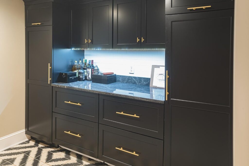
This deep, dark black cabinetry makes a dramatic bar service area. The simple matte brass hardware pops against the flat black, and the gray granite with bright, white tile backsplash draws your eye in and pulls everything together without it becoming heavy or visually overwhelming. It also works well alongside the black in the tilework, with the pattern leading your eye straight to it.
GO DECO

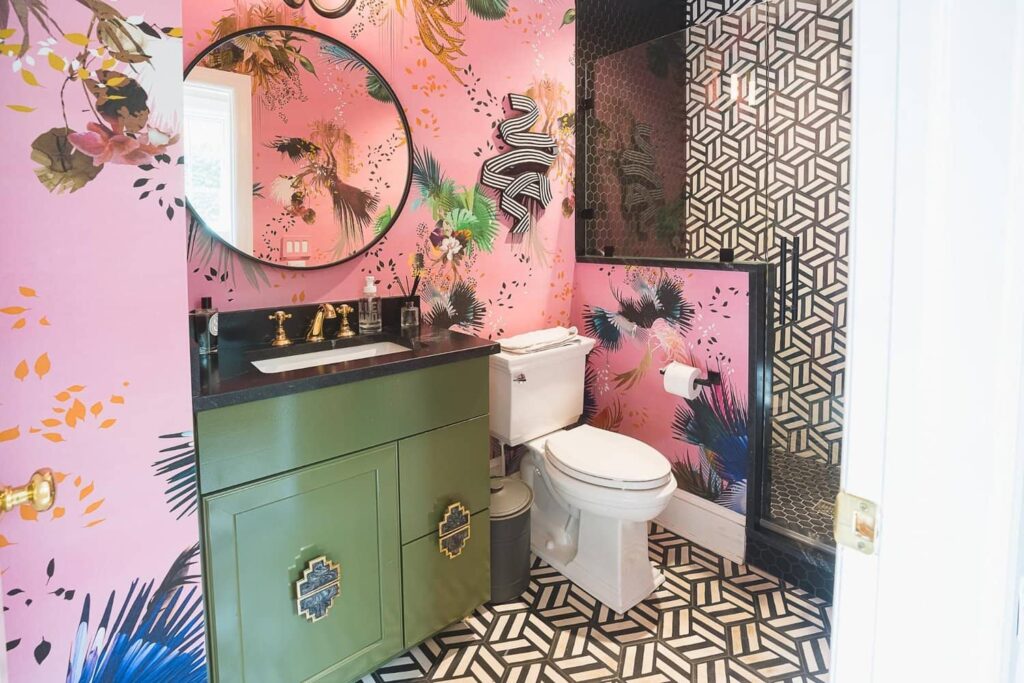
This client’s bathroom is oozing with personality. Anchoring the wildly fun wallpaper, deco tile and eclectic artwork with a solid green vanity and black stone countertop really pulled this design together.
HALF AND HALF

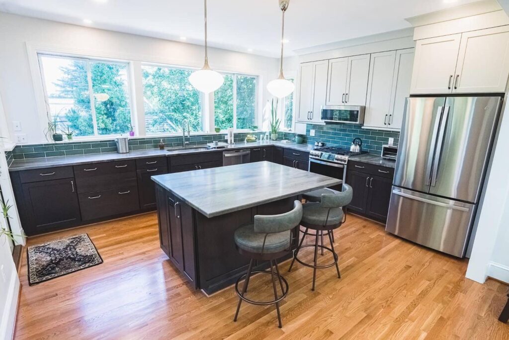
This hip, open-concept kitchen embraces both the dark and light style trends for great balance. Thanks to large picture windows, the kitchen has a very horizontal design, segmenting it into an upper and lower half. The green tile backsplash is an excellent delineator that also visually blends into the wooded view from the windows, giving the whole room an expansive feel. Dark cabinets on the bottom ground the room and create great visual contrast.
SMALL SPACES, BIG IMPACT

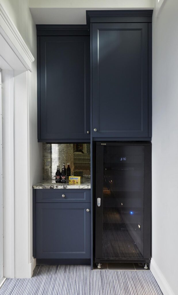
If you want to dip your toes into the dark cabinetry movement, you can always start small. This wine bar not only makes the most of otherwise unused space, it makes the most of its potential design impact. White cabinets would have left this little nook unnoticeable, but the pop of deep blue paired with a high movement granite and antiqued glass backsplash make a serious statement. The darkness of the cabinets also keeps the black wine cellar fridge from looking out of place. Happy Hour anyone?
White, light cabinetry and design aren’t going anywhere anytime soon, and for good reason – it is a classic look that never goes out of style. But it might just be time for dark, moody design to have its moment and we’re looking forward to seeing the various ways this trend continues over the next decade.
