One of the greatest increases in demand we’ve seen with residential construction and renovations lately have been in outdoor living spaces.
At James River Construction (JRC)
Over the last few months we’ve had the pleasure of working with Campfire & Co. on a website and brand “refresh” for James River Construction.

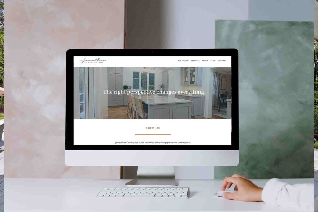
We love the simple elegance of our new digital space!
Campfire & Co. is a Richmond-based design studio that specializes in branding, brand strategy, website design and branded interiors. They have a stellar reputation in the region, and have specialized knowledge of the home construction and renovation industry. As we undertook this intentional design shift together, we began to realize that the process isn’t all that different from what we do with our own clients.
Whether a renovation is being done in a digital or physical space, they all start with a “why?” The “why” behind our brand and website refresh had to do with the rapid growth we’ve experienced over the last decade. We wanted clients to understand what we are capable of, and also to be able to see that the quality and consistency of our work has continued at every step. As clients’ needs evolve, we are evolving alongside them, but never budging on our commitment to our process and outcome.
To talk more about their process and the similarities between the work Campfire & Co. does in digital spaces, and the work we do in physical spaces, we picked the brain of one of Campfire & Co.’s Partners and Lead Strategist, Christie Thompson.

The new website includes classic elements of our brand while also giving it a breath of fresh air.
JRC: James River Construction was an established brand when you started working with us. What things do you consider when doing a “brand refresh” for a website build – how do you take certain brand elements into consideration while still making it feel fresh?
C&Co: With any design project, we always begin by brainstorming and creating a thoughtful brand strategy. The strategy is our North Star of the project and outlines big picture goals, values, audiences, and differentiators as well as the brand’s personality. For a brand refresh, our strategy typically builds on what a brand already knows about themselves while also taking into account the catalyst for the project – usually a minor adjustment to positioning or alignment of visuals with the quality of service. That was absolutely the case with James River Construction. The team knew the quality of their product and attention to customer service were major differentiating factors, they just needed their brand experience online to match that elevated experience.
For the brand and website specifically, we took the best aspects of JRC’s existing identity and supplemented where we wanted to make improvements and add to it. We expanded the brand color palette and typefaces to give us more visual flexibility and designed new website layouts to support and celebrate enhanced storytelling.
JRC: We specialize in renovating and remodeling existing homes, which isn’t completely unlike what you did for our brand and website: taking something that exists, using the best elements, and making some weak areas better. Can you speak to that process of “renovating” via digital design? As a firm who also handles interior projects, we suspect there always exists a connection in the way you approach both physical and virtual spaces.
C&Co: That’s a great comparison! You are correct, we do take a visual audit of sorts when working with an existing brand. In addition to paying attention to strong areas vs. weaker areas, we also consider what aspects of the brand have a lot of equity with their audience. The James River script was one of those elements we decided to keep in order to maintain some consistency with the brand visuals before and after the website redesign.
As for other areas of the brand “renovation,” it always goes back to goals! When we begin with a strong understanding of a client’s big picture goals, it gives us a clear road map for where to focus our effort in order to help them accomplish their vision. For James River Construction, we focused on elevating the brand visuals and celebrating the stories behind the work.

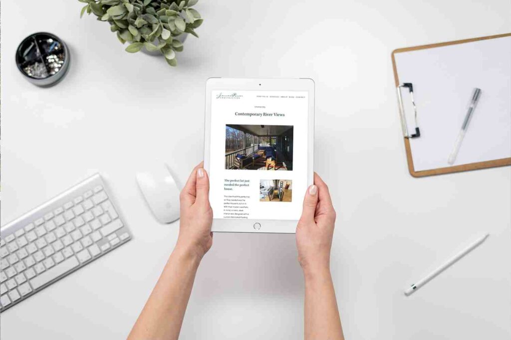
Our website’s new portfolio allows us to tell more in-depth stories about our projects.
JRC: Again, as a firm who does interior projects for brands, are you drawn to clients who work in the design space? If so, how does your own expertise help you connect with those types of clients? Do you feel like you have a better understanding of their process, challenges and differentiators?
C&Co: Yes, absolutely! We really love working with fellow designers and builders in the construction industry. We have a shared language and understanding of a really unique industry. There’s so much mystery around building and construction, so it’s a really fun opportunity for us to lend our experience to help clients like James River Construction articulate their value and expertise to their audiences.
JRC: Was working with JRC any different than other brands? Do you find that construction and design clients approach this process differently than other types of clients in general?
C&Co: We are really not just saying this as lip service, but working with James River Construction was a dream! Collaborating with established brands is really a joy. They tend to know themselves more deeply and have a very clear understanding of their goals than a typical startup or new business can at an early stage. Additionally, JRC values an organized process and schedule as much as we do, which makes a project run so smoothly. The team was always on top of what they needed to do and gave really thoughtful feedback at every step of the way. It’s clear they value the importance of design and aesthetics and I imagine a big part of that is because they’re in a similar industry to us.
JRC: What are your favorite elements of the new JRC website? What do you feel like C&Co. really nailed on this project?
C&Co: One of my favorite elements of the new site is the color palette. Previously the JRC site was using a lot of gray tones and it wasn’t evoking the warmth and personality of their team. The new earthy palette we landed on feels both modern but deeply inviting and we worked really hard to get that perfect.
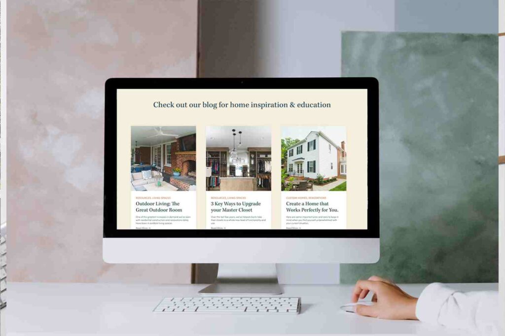
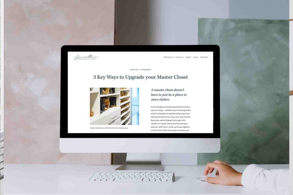
My other favorite part of the site is how much more prominently the blog is featured. The James River Construction team creates and manages an incredible collection of resources for their audience and it deserves so much more celebration on the website than it had previously. It was really fun to work with clients who value a great blog as much as we do!

We use our blog as a space to provide resources to clients and non-clients alike.
JRC: Any advice for businesses looking to do their own “brand renovation” – anything they should take into consideration first or first steps they should take?
C&Co: Yes, definitely! We actually wrote a blog post about this specific topic, Three Signals You’re Ready for a Rebrand, but the “too long; didn’t read” version is if people are confused, your visuals are misaligned with your offering, or you have big changes happening, it’s probably time to re-evaluate if your brand is working for you and consider a change. It probably goes without saying, but our first step for literally anything is to write some goals. So start there and then check out that blog post if you’d like more in-depth advice! Or send us an email, we’d be happy to chat! 🙂
A huge thank you to the entire Campfire team for their hard work on our website renovation – it was a true pleasure, and we love our new space!
